In a case that could be straight out of a legal TV drama, a computing font has cost a couple two houses in a Canadian bankruptcy case. The Superior Court of Ontario ruled against Gerald and Kathryn McGoey earlier this month in a dispute over two property trusts.
The couple married in 1994, each bringing children from other marriages. Shortly afterwards they jointly purchased a cottage called Ledge Lodge in Muskoka, Ontario for $700,000. In 1993, they jointly bought a farm in Caledon, Ontario called Humber Station for $635,000.
Gerald McGoey became CEO of wireless TV broadcaster and ISP Look Communications in 2004. The company ran into financial troubles four years later, selling off some licensed broadband spectrum that it owned at bargain prices. Look gave McGoey a $5.6m payout for closing the deal, which shareholders later disputed based on an invalid share price.
Look sued McGoey and other managers in 2011 to reclaim the payment. In June 2017, Look won and McGoey became officially bankrupt later that month.
The McGoeys claimed that the two properties were held in trust for their children, offering as evidence documents that they said were created and signed in 1995 and 2004.
The courts decided that the trusts claimed by the McGoeys were shams, and one of the most convincing pieces of evidence were the fonts used to create them.
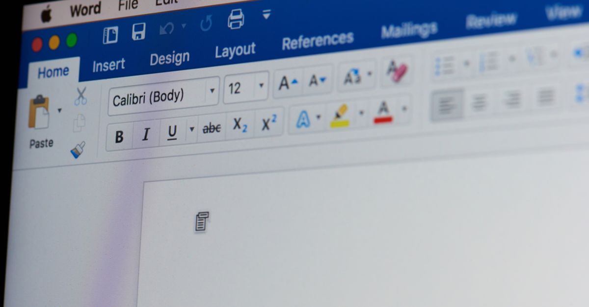
The bankruptcy trustees called in Thomas W Phinney, an expert in design and typography who spent over a decade working for Adobe. Phinney, who describes himself as the Font Detective, noticed that the Ledge Lodge document supposedly written in 1995 used the Cambria font, while the Humber Station document used Calibri.
Both of these fonts were part of the ClearType font collection developed for Microsoft in 2002, which didn’t become available to the general public until the company used it in Vista and Office 2007 five years later. That made things a bit awkward for the McGoeys.
The court documents explained:
Because Cambria typeface did not exist on January 4, 1995, the document set in the typeface Cambria, allegedly dated January 4, 1995, could not have been created or signed on that date.
What about the Ledge Lodge document, supposedly signed in 2004? The font officially existed at that point, after all. He is sceptical about that, too:
Mr. Phinney deposes that no one, other than a Microsoft employee, consultant or contract designer, could have created a document such as the Humber Station document using the Calibri typeface in March 2004. Even if they did, however, the Humber Station document uses Calibri’s “tabular lining” numbers, which did not become the default Calibri numbers until after November 2005.
If the documents were dated between 2007 and when Gerald McGoey ran into financial trouble in 2010, they would have been more convincing. However, this evidence was just one red flag pointing to sham trusts, explained the court. Others included the fact that the couple declared personal control of the properties for their own use in the letters, along with their failure to mention the trusts to their bank.
Calibri has laid people low in legal cases before. Maryam Sharif, daughter-in-law of former Pakistan prime minister Nawaz Sharif, was caught using Calibri in a document claiming a trust that was supposedly signed in the year before it entered general distribution.
I am a trustee & NOT the owner. Proof attached. #TheTruth pic.twitter.com/5hCtkiYtDY
— Maryam Nawaz Sharif (@MaryamNSharif) November 15, 2016
Phinney weighed in on this case at the time:
If you have a document:
- whose authenticity is already in question
- which was not created by somebody who is a likely Windows pre-release user (not a programmer or the like), nor a hard-core font geek like me
- and it is then noticed that it used Calibri back in February 2006
Then the odds are strong the document is a forgery.
Lucas de Groot, who invented the font, was also sceptical about the document’s authenticity.
All of which is to say that if you’re going to try and forge historical documents, you should do your research first. Times New Roman, released in 1932, is a good bet for revising anything recent unless you’re trying to claim something about, say, the Brooklyn Bridge. In that case, you might want Bookman, released a healthy nine years before its construction began. To be completely safe, you could opt for Textualis, an early form of blackletter typeface used in the Gutenberg Bible. We joke, of course, don’t forge historical documents.
As for the McGoeys, perhaps correspondence in Comic Sans might be appropriate for a while?
Tony Gore
The font is a compelling one, but I suspect that analysis of the ink and pattern, whilst harder, may have also been possible. Presumably the document was also signed by hand, and people’s signatures change subtly as they get older. But forging a document supposedly created before something existed is a classic failure, and one for the incompetent rogues gallery.
jimntexas
This is identical to the fake “Bush national guard document” that Dan Rather bit off on. Know as the ‘Killian documents controversy’ the forger faked up a bogus letter from a military supervisor concerning George W. Bush’s National Guard service.
The forger used default MS Word settings to type his fake letter. The problem was the letter was alleged to have been written in 1973, when monospaced typewriters were used for all military memos and such. At least 20 years before any proportional spaced output device would have been used for routine office work, let alone one with MS Word default typeface and spacing.
John Hall
What if the original document was re-formatted with a new font some years later ?
Paul Ducklin
The court record (link in article) says that “Mr. McGoey’s evidence, and the inference of Mrs. McGoey’s evidence, is that their signatures were placed on this document on January 4, 1995.”
In other words, the document in question was supposedly printed out in that format in 1995 and signed in that format at that time.
Thomas W Phinney
That means the signed document was backdated. Which is exactly the conclusion the court reached from my report.
Rico Robbins
They’d be better off using Wingding from now on lol!
CyberJingo
We have massive failures even in today’s times with large teams and national resources. Just look at the Adobe Photoshop layers of scans and edits for the foreign-born Muslim, Obama’s birth certificate which should have been one scan, one layer.
Mark Stockley
2008 called, it wants its conspiracy theory back.
Mahhn
FYI: His mother was a US citizen, which that makes him one by law no matter where he was born. All the talk about it was just to make drama and sell advert space. Anyone that knew the law, saw all of the talk about it as BS parroted by fools and antagonist. See: USCIS Policy Manual, Volume 12, Part H, Children of U.S. Citizens.
Caleb
Typical nonsense. He was born to an American mother, so that automatically makes him an American citizen. Maybe civics is a place for you to start.
Glenn Fleishman
Times New Roman is also suspect, because there are so many variants of it, and modern versions are in constant flux (despite the seemingly identical quality of them). One type researcher I interviewed said he retained every micro-release of Times from Microsoft, sometimes involving extremely tiny changes, and in a forensic setting could likely pinpoint a document of sufficient length and at sufficient resolution based on the features of certain characters that changed over time!
Paul Ducklin
I suspect there are lots of microdifferences between releases of fonts that most of us would consider identical – even if it’s only down to a tiny detail of the font “hints” that are there to advise the font renderer how to scale the font reliably, or minute tweaks to a couple of Bezier curves…