Google’s Safe Browsing project is designed to protect web users by throwing up a warning screen when you attempt to browse to insecure websites.
That includes sites that use untrusted certificates, harbor malware, foist deceptive software, or those suspected of tricking users with social engineering, such as phishing sites.
Now Google has added another category of social engineering to its Safe Browsing service – deceptive embedded content, including ads.
According to Google’s Lucas Ballard, Safe Browsing will consider embedded content on a webpage as social engineering if it:
- Pretends to act, or looks and feels, like a trusted entity such as your device or browser, or the website itself.
- Tries to trick you into doing something you’d only do for a trusted entity, like sharing a password or calling tech support.
Ads that violate this policy include those with warnings that your software is out of date and you need to update, sometimes mimicking dialogue windows like this one below.

Google also says embedded content such as “Download” or “Play” buttons are forbidden if they’re designed to look like they are related to actions on the site (like watching a streaming video), but may whisk you away to another unrelated website.
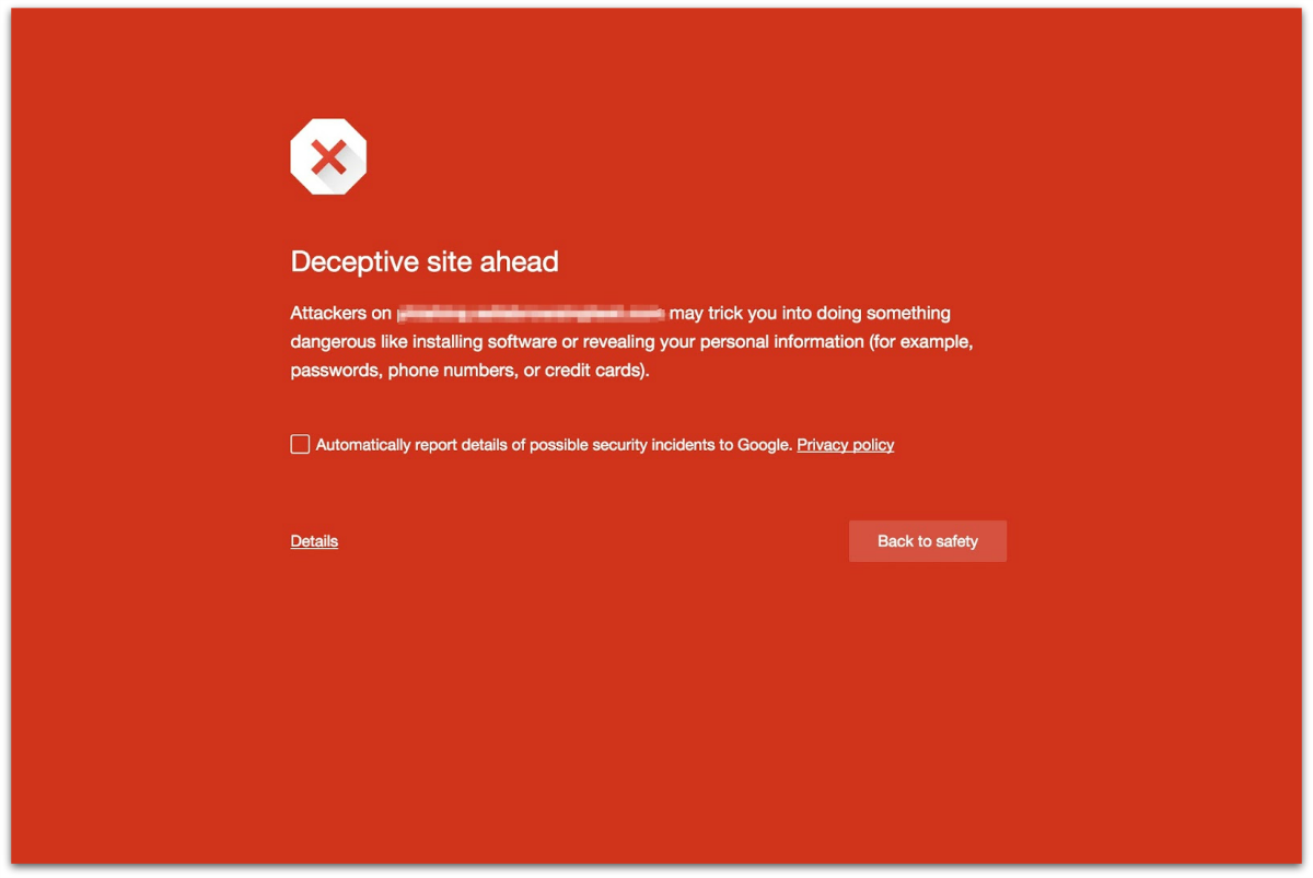
If you do come across a website with deceptive embedded content, you’ll get a bright red warning screen telling you there’s a “Deceptive site ahead,” and containing the message:

Attackers on XXXXX.XXX may trick you into doing something dangerous like installing software or revealing your personal information (for example, passwords, phone numbers, or credit cards).
There’s an option to go “Back to safety,” which will navigate you away from the site.
Google changed the design of its warning pages last year after it found 70% of Chrome users were ignoring them.
Image of deception courtesy of Shutterstock.com.

Craig
Pretty sure I’ve seen some Google Adsense ads that wouldn’t pass Google’s own guidelines…
Allen Baranov
Not very useful if they implement it as per the above.
For example – Spedtest by Ookla. The whole site is a mess of advertising that says “start” and “play” etc and I know that it is all tricking me. However, where is the correct place to click to start the test? Giving me a warning that there are bad averts on the site doesn’t help me – rather put a red border around all of the bad adverts or stop me clicking on them by mistake with a warning.
Although, I know that it will never happen because it will be seen as Google (via Chrome) changing the Internet and that would never fly – especially when they are messing with adverts that are put there from competitors. So essentially they will do the best they can and warn me about something I already know.