 POPUP ALERT!!!!
Be it the iconic yellow “Yield” sign with an exclamation mark inside or, say, the red lock with a warning “X” meaning “broken!”, popup alerts warn people away from risky business, right?
You would hope so. When we’re talking specifically about SSL (Secure Sockets Layer) warnings, the consequences of ignoring alerts can be pretty dire: eavesdroppers modifying or reading emails or tweets, or attackers intercepting credit card or other sensitive data, for example.
Google’s security team has analysed its own SSL warning interface. The team had tinkered with that interface and put out a simpler, hopefully less confusing one in Chrome 37, with the hope that it would teach users more secure behaviours.
The results of the redesign weren’t exactly what you’d call breathtaking, it tells us.
In an Association for Computing Machinery (ACM) presentation and paper, the Chrome security team tells us that the redesign did in fact nudge up secure behaviour a bit, but there’s still plenty of work to be done.
The problem
Prior to Chrome 37, most Google Chrome users would not back out of SSL quicksand. In fact, a mere 30% of Chrome users adhered to SSL warnings.
(For whatever reason, Firefox users are far more compliant with the browser’s SSL warnings: 70% adhere to the alerts.)
Why would most – 70% – of Google Chrome users “proceed anyway” rather than get “back to safety”?
They’re jaded, alert-numbed or confused, so they simply ignore alerts, Google says, particularly when the alert is jargon-filled, isn’t succinct, isn’t specific, or is flat-out wrong.
There are multiple reasons why alerts can be wrong. For example, 20% of HTTPS Strict Transport Security (HSTS) errors are caused by clocks being set wrong, Google says.
Other errors are produced when an employer has a DPI box or content filter between a user and the internet, or a client is missing a root certificate.
In such cases, a user will get an SSL warning that tells them nothing, and serves only to teach them to click “OK” on a dialogue, Google says.
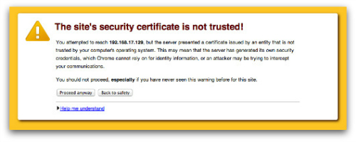
Here’s the old warning that everybody loved to ignore:

Confusing warnings only make users more insecure, and they normalise risky behaviour, Google says. Google had tried to make the interface easier to understand, and to restrict itself to giving warnings only when there’s a real risk.
What’s a real risk? Well, on one hand, there are misconfigured servers or firewalls triggering spurious warnings.
On the other hand, users who ignore an SSL warning and proceed can face physical harm or imprisonment.
From the paper:
Browsers display SSL warnings when the encryption is too weak or the server could not be authenticated. The connection is immediately halted, pending the user’s decision about the warning. In some cases, the problem indicates a real attack. Syrian Internet users saw SSL warnings when the Syrian Telecom Ministry allegedly attacked Facebook users. Similarly, SSL warnings alerted Chinese Internet users to attacks on Google and GitHub.
So how did Google seek to change user behaviour?
Google set out to explain SSL dangers in alerts, with an eye to conveying:
- the threat source (the attacker is on the network, as opposed to being on a malicious site, for example),
- the specific data that’s at risk (“passwords, messages, or credit cards”, for example), and,
- with an emphasis on errors on well-regarded sites, such as bank sites.
The goal was to strip the alerts of jargon, to hit a sixth-grade reading level, to be as brief as possible, to be specific about the risk, and to provide enough information.
To the Google team’s surprise, these types of text tweaks didn’t affect user behaviour, regardless of how simple, specific, or non-technical they made it.
They managed to moderately improve users understanding of the risks, but not adherence to the desired “get me out of here!” behaviour they were after: users instead kept walking straight into the quicksand during testing.
OK, so what did work?
The one thing that did work was to change the design elements of the warning.
Google used what’s called “opinionated” design, which relies on visual cues to promote the choice that designers think is the safest action.
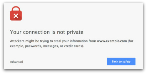
Some of the visual elements of the so-called opinionated design, which was the one Google opted for at the end of testing:
- The safe button is a bright blue color that stands out against the background: the same blue that Google uses in other properties for primary actions. In contrast, the unsafe choice is a dark gray text link.
- Hiding the unsafe choice, forcing users to jump through hoops to do something unsafe. The Google Chrome malware warning hides the “proceed” button behind an “Advanced” link. For what it’s worth, Firefox users actually have to click four times to proceed through Mozilla Firefox SSL warnings. That one isn’t a complete win-win: Google notes that this element increases the annoyance factor, given how hard users have to work to ignore false positives.

The results were dramatic: the opinionated design of the new SSL warning nearly doubled user compliance.
Adherence rates went from 31% to 58% in a controlled field experiment, and from 37% to 62% in the field following the release of the new warning.
Still, too many users don’t get it, Google says, and having users understand is even more important than having them mindlessly comply:
Unfortunately, comprehension rates remain lower than desired for all of the SSL warning texts that we tested. This is disappointing, as we view comprehension as more important than adherence. ... We attribute the low comprehension rates to the difficulty of creating an SSL warning that is simultaneously brief, non-technical, simple, and specific.
Readers, where do alerts fail you?
Image of warning courtesy of Shutterstock.
